Mockups of aqua's notification page, landing page, and sign in page.

aqua

Role

UX Designer

Team

Yingyan Wu
Alexandria Wang
Ahtziri Sanchez
Tristin Proctor

Timeline

10 weeks

Tools

Figma
Illustrator

Overview

Over the span ten weeks within an in-course design-a-thon, myself and a team of designers worked to create aqua: a wellness-based mobile application that encourages users to develop both short-term and long-term hydration habits by maintaining their own virtual ocean reef. I served as a UX designer and researcher, working collaboratively through each step in the research and design process working to deliver high-fidelity mockups and a functional prototype informed by data gathered from our target user base. Upon final presentations and demonstrations, Aqua was awarded Best Visuals and Research Story and was selected to be among the small subset of presentations showcased to a panel of esteemed UI/UX designers and researchers.

Brainstorming

As a design team, we held a brainstorming session to discuss individual problems and pain points that could be automated or made easier. Everyone expressed that, especially in context of the COVID-19 pandemic, they struggled the most with finding motivation for simple, everyday tasks. We also agreed that, as college students, the tasks that were most often forgotten or overlooked by ourselves and our peers were those that related to personal health: eating three meals a day, getting enough sleep, or drinking enough water.

We agreed as a team that drinking a healthy amount of water every day was something that was unquestionably important but also difficult to measure and keep track of for long periods of time.
This was a difficult process for us,  we contemplated as a team how we could balance a motivating gamified environment while also reducing challenge and stress on the user. 📱 ✨

The Problem

How can we incentivize users, who might otherwise feel unmotivated or anxious, to establish healthy hydration habits?

Research

Competitive Analysis

We started with a competitive analysis of other popular water-drinking applications to better understand their strengths and weaknesses in comparison to aqua’s desired functionality. Each row in the following table represents a feature present in the applications we evaluated, such as whether the app reminds users to drink water, recommends daily water intake, prioritizes long term and short term hydration, etc. From this analysis, we learned what features and functionality were most popular for water-drinking applications, as well as what features aqua would implement in order to capture the strengths of all competitors.
A competitive analysis graph comparing aqua to Drink Water Aquarium, Hydro Coach, WaterMinder and Aqualert. Out of all the apps, aqua is the only one that reminds users to drink water, recommends water intake, displays water-drinking history, gamification based, wellness focused, and prioritizes short and long term hydration.
Although there were a variety of hydration-related apps, we found that nearly all of them were strictly health and fitness-related. Among the very few that were gamification-based, they had very limited health-related functionality, such as water intake recommendations or tracking a user's water intake history. Additionally, none of the apps in this subset were wellness-focused. With aqua, we sought to create the best of either: a hydration app that is as simulating and motivating to use as it is practical.

Survey

We then conducted a survey of approximately 30 users within our target audience of students, professionals, and younger participants. We asked them a series of questions related to their daily water drinking habits, including how much they drank, and whether they personally thought they drank enough water. We found the following metrics:
38%
of respondents thought that they drank enough water daily
0%
of respondents actually drank a healthy amount of water daily
This discrepancy in data accurately reflected our observation that a healthy daily intake of water was difficult for users to quantify and measure. From these findings, we understood that in order to best meet our audience's needs, aqua's handling of user hydration and accompanying reward system must be as simple as possible. It should accurately make recommendations for users based on their personal metrics, while also allowing them to make their own decisions based on their own needs and lifestyle.
We defined a "healthy amount of water" as the recommended daily water intake of half one's weight in ounces. Everyone's different, but we thought this was a good place to start. 💧 🐠

Design

Branding and Style Guide

The first phase in our design process after our initial ideation and some beginning sketches was deciding the base components of aqua's visual identity: it's color palette and typography. We knew that these decisions would heavily inform our aqua's overall look and feel and ultimately, how our app would be perceived by end-users. We also knew, as designers, how difficult it often is to come up with the perfect style guide. We were also well-aware and equally wary of the amount of designers (and therefore, opinions) in the room. So, to start things off, we held a group brainstorming session where each team member selected their own color palette and typography. We did this each on our own — no peeking!
Figma Workspace of each team members proposed color palette and typography.

Wireframing

With out new style guide and initial sketches in mind, we delved into wireframing. This was an iterative process that spanned approximately 3 weeks. We created iteration after iteration of potential logos, navigation bars, overlays, and page designs, consulting and co-creating as a team what we liked, didn't like, and wanted to improve after each set of iterations. Our Figma workspace below shows a little bit of our design process and the various wireframes we went through before deciding on our final versions. As a team, we all worked collaboratively on the workspace, designing together remotely over voice chat.
Our workspace definitely had WAY more pages before Ying went through and cleaned a lot of it up for visibility, so this only shows about 30% of the amount of total iterations we designed! 🤯
Figma Workspace of all wireframe iterations for Aqua.

Lo-Fi Prototyping and Usability Testing

After creating an initial set of iterations we felt confident in, we established several basic user flows and I created a low-fidelity "paper" prototype, a slidedeck of static wireframes. I used this lo-fi prototype to conduct a series of user interviews with participants from our target audience alongside another group member who co-facilitated. Each interview was recorded for the group to listen, analyze, and report back to in case they needed. I took notes and presented the key takeaways from these interviews to our group, bringing up usability issues such as a "too toggable" interface when adding water, and conflicting forms of navigation between pages. I led the discussion of how to improve our design based on these findings, and together we ideated and implemented improvements which fixed these and prevented similar usability issues.

Final Mockups and Hi-Fi Prototyping

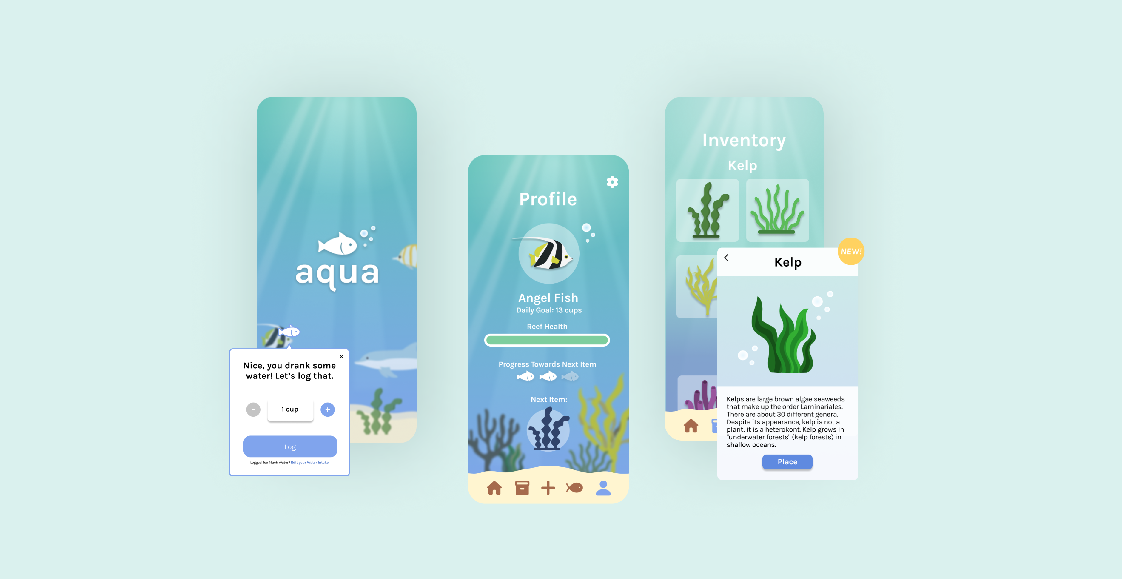
From these improvements and further iterations of wireframing, we created our final set of mockups. A subset of them is displayed below. From left to right: aqua's launch page, home/reef page, item inventory page with item info overlay, water intake page with add water overlay, fish catalogue with fish info overlay, and profile page.
Final mockups of aqua's launch, home/reef, inventory, water intake, catalogue, and profile pages.

Final Demo

Once these we complete and we were set our our designs, we moved on to creating our final interactive prototype. Below is a guided demonstration of the functional prototype we created and presented. Enjoy!

Results

We were able to successfully design for all of our intended functionality and delivered a full presentation of our design process and prototype.

Our team was awarded Best Visuals and Research Story for our work on Aqua, and was selected to be among the small subset of presentations showcased to a panel of esteemed UI/UX designers and researchers.

Aqua is now currently in development to be launched on iOS operating systems, with Android operating systems scheduled for future development.
Aqua competed against a total of approximately 20 other design teams. We definitely didn't expect to win, so I was definitely I little nervous for our team acceptance speech. 😣

Reflections

Working on aqua gave me valuable experience and insight both as a researcher and as a designer. As someone who is most commonly designing alone or as one of the few designers on a project, I learned a lot from working on a team of a fellow designers. Some key takeaways are:

Be open to new ideas.

A team of designers means a room full of diverse perspectives, opinions, and ideas. While working on aqua, I learned to lean into these creative differences, and my group mates did as well. As a result, we were able to create an end product that was all the more dynamic because of it — one we felt we all co-designed and contributed to.

Iterate, Iterate, Iterate

Design is an infinite process. The more I understood this, the more satisfied I felt knowing I could always reiterate on my previous designs.

Feelings are Important

Design is the most intuitive and engaging when it's something you care about. So, if something is making you feel a certain way: it's important. In every step of the process, we assessed how ourselves and the user might feel when interacting with aqua. These feelings gave us valuable insight into what was going right and what needed to be fixed.